I first became aware of John Yates in the '90s through his graphic design work on records by the likes of Neurosis, Jawbreaker, and Nomeansno. During that decade, he was the in-house designer for Jello Biafra's Alternative Tentacles Records label, making his work ubiquitous in cool record shops throughout the world.
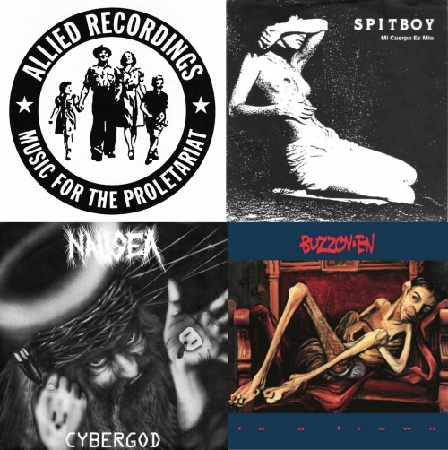
While he was at Alternative Tentacles, Yates also ran Allied Recordings, releasing titles by such bands as Antischism, Buzzov•en, J Church, and Hot Water Music, often designing the layouts along the way.
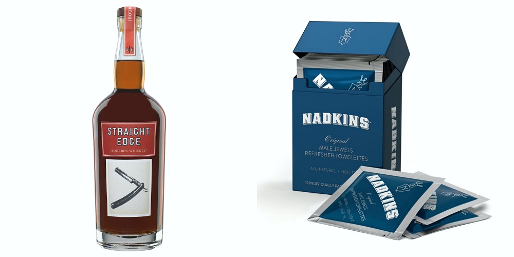
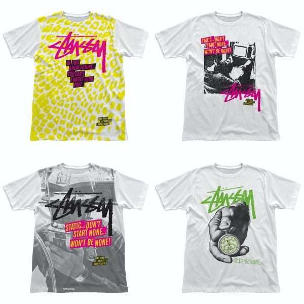
Since going freelance and starting Stealworks, you've probably seen Yates' work for brands like Burton Snowboards and Stüssy, and book designs for AK Press, Pluto Press, and Chicago Review Press, among other publishing houses.
Being a fan of his for so many years now, it was a pleasure being able to chat with Yates and learn a bit more about his history.
Tell me a bit about your formative years in the UK, and how the intersection of music and design became your focus.
Punk rock officially entered my life when I entered a local Woolworth store to purchase my first record. They had all the records on the wall with numbers next to them. It being my first time, the record I intended to buy (and I cannot for the life of me recall what it was) isn’t what I ended up with, as I had confused the numbers next to the records, and I was too embarrassed to correct the mistake with the clerk. When I got home, I went to the family record player and put my single on the turntable. It turned out the be “Sheena Is a Punk Rocker” by the Ramones. The rest, as they say, is my story.
Where music intersected design for me was when I discovered Crass, although at that time I had no real idea what design was. All I knew was that what I see (and heard) moved me and spoke my language. It was the voice I never knew I didn’t have, and the visual language I was looking for. After that, I typically purchased records based on how they looked if I didn’t know of the band. I think that’s why I ended up with a wide spread of musical interests and tastes, but basically within the punk/new wave/no wave genre.
Did you study art and design, or are you completely self-trained?
I attended two technical colleges in the UK, two years apiece, so not a traditional art school. Technical colleges provided more practical aspects of a field of study, so I studied art history, graphic design, editorial design, printmaking, photography, and general art techniques. In terms of what I’ve done for the bulk of my design “career,” I was self-taught when it came to using a computer to create with.
Who were some of your key graphic designer influences?
Gee Vaucher of Crass, Winston Smith and Jello Biafra of Dead Kennedys, Barbara Kruger, most of the main pop artists, but Robert Indiana in particular, Saul Bass, Jamie Reid, Barney Bubbles, Vaughan Oliver, Alvin Lustig, David Carson, Reid Miles, and the WPA to name a few.
You moved to California to work for Alternative Tentacles. How did that relationship begin in the first place? What were some of the early projects you worked on during your time there?
While still living in the UK, I used to mail-order records and shirts from the Alternative Tentacles London office (I lived in a rural region and mail-order was often the only way to get certain things). I started a correspondence with the guy who ran the label for Dead Kennedys, and when I started producing a zine, I used to send him copies, along with other artwork I produced. Unbeknownst to me, he was forwarding this stuff on to Biafra in the US.
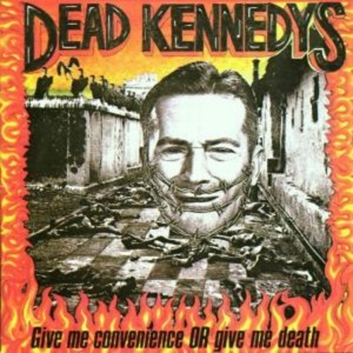
Then, one day out of the blue, Biafra called me up and asked if I’d be interested in helping him produce the booklet to accompany Dead Kennedys’ swan song compilation album, Give Me Convenience Or Give Me Death. I said I would love to, and that was how things began, culminating in me relocating to the States the following year.
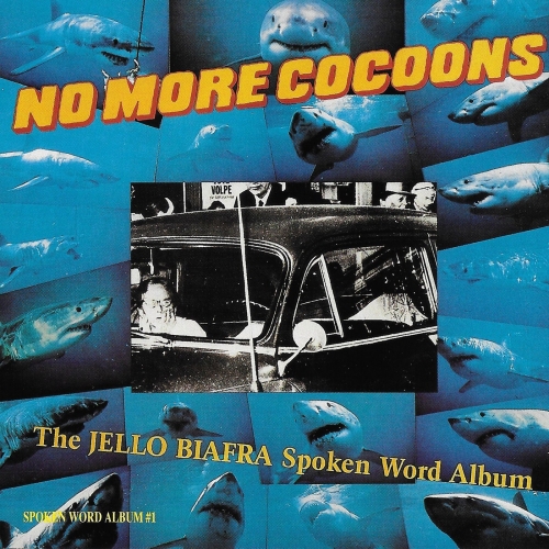
I think the first project I worked on after moving was Biafra’s No More Cocoons spoken word album. After that, I worked on, in some capacity, every single release on the label for the next decade. So, 1988 to 1999 or so.
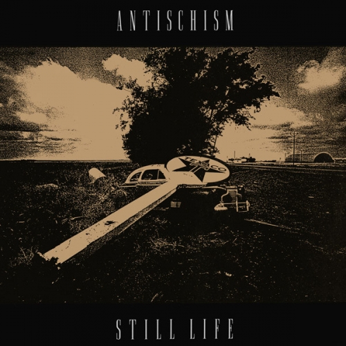
During your time at Alternative Tentacles, you started Allied Recordings, a label that released titles by the likes of Antischism, Buzzov•en, and Spitboy. How tough was it juggling both the design aspect of your career and the Allied duties during that period? How important was having Jello and the other people at Alternative Tentacles there to bounce ideas off of?
Well, given that I tended to be a workaholic at the time, it wasn’t really that difficult to manage both at the same time. Also, Allied wasn’t exactly a full time thing ever. I only really intended to put out a single, just to have done it, having learned all aspects of a record’s production—not just the artwork—while working for Alternative Tentacles. But one single ended up at 100 releases after about 10 years, and because I was a much better designer than I was a business person, the label always suffered, and in some cases, I’m sure the bands suffered also.
I was never able to afford to offer much besides putting out the records. There was no tour support, no merchandise, etc. And on quite a lot of the release I generally lost money.
This was always balanced by the few bands that sold records and made a little, but as I liked to focus on unknown or less well-known bands, the financial aspect of the label ultimately wasn’t possible for me anymore. I came out of Allied in debt personally, but that wasn’t surprising, given my poor business acumen. But it was fun for a while!
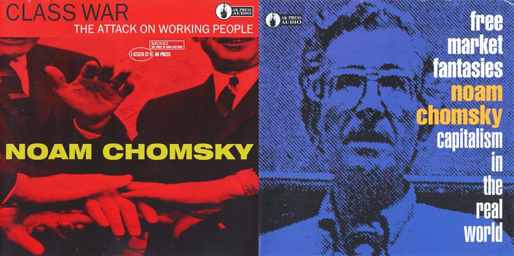
Before I move on from Allied Recordings, I have to ask you about Noam Chomsky. How did you end up working with him and releasing his records?
I had nothing to do with any titles that featured Chomsky. My best friend’s small anarchist publishing entity asked if I would lend the Allied name to their releases, so my distributor would carry them, so I helped a friend in those cases. It was essentially nothing to do with me or Allied. I’m certainly a fan of him as an educator and philosopher, but that’s the extent of it.
Of all the Alternative Tentacles and Allied Recordings covers you designed, which would be your favorite from each label?
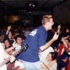
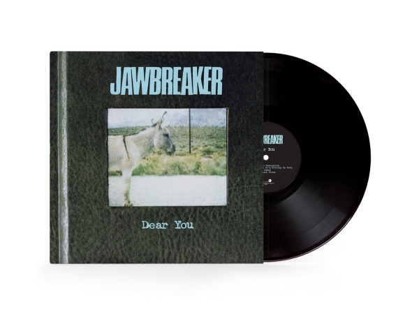
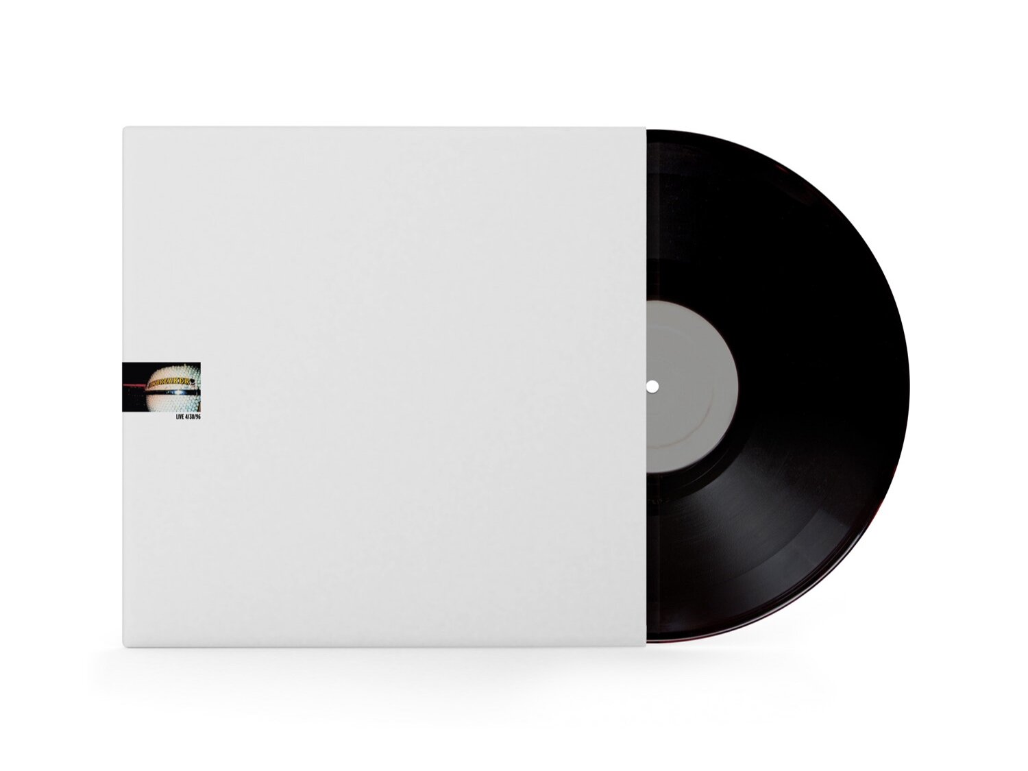
That’s tough one as I am my own worst critic. But, if I had to choose a couple of examples, I’d say Jawbreaker Live 4/30/96 (it took until the label’s last-ever release for me to actually be happy with something I designed) for Allied, possibly the Antischism album.
And for Alternative Tentacles, I really don’t know, honestly. I like to think my work improves with the mileage, and I think back then I was pretty naive when it came to design. There isn’t one that comes to mind that I am particularly proud of, if any. Not sure what that says about me as a designer, but there you have it.
In the years since working at the labels, you’ve done a ton of projects across many industries. How often did your connection to punk help lead to landing a client? Give me some highlights that you’re particularly psyched about from that body of work.
I can’t honestly recall any single job that came from my having worked at, or for, record labels, besides other band/label clients. I fell into ad agency work via a friend at the time, and I got into book cover design helping out a good friend. Everything else has just evolved from there, really. I don’t know that my background is particularly relevant to anyone that wasn’t connected to that period of my life. If it were, I might be able to find work!
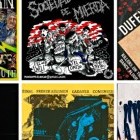
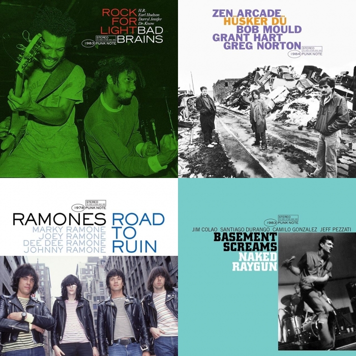
You’ve recently started posting reimagined punk record covers done in the style of the classic Blue Note jazz records. What inspired that idea, and have you heard anything from some of the bands you’ve done it for so far?
I have not heard from any of the bands I have produced reimagined Blue Note covers for so far, and there’s only a few more batches to post as of today, but I did have a guy from a band I chose not to produce one for reach out and ask if I wouldn’t mind doing one for his band. I did, as a favor, but it isn’t a part of the series. I knew of the band, but wasn’t particularly a fan, so did not include them in the 200 titles I did produce.
I have always been a fan of Reid Miles’ work for the Blue Note label, and have tried to pay (very poor) homage to his work in the past, but decided that I’d come up with a few personal favorites for my own edification. That ended up morphing into 200 titles from 1965 to 1990, the year I decided to end with, for better or worse.
It was also good therapy, having lost my job to the pandemic, and having way too much time on my hands. Colliding the two worlds seemed to make sense, and was fun. I certainly don’t think they all worked well, but most did, I believe.
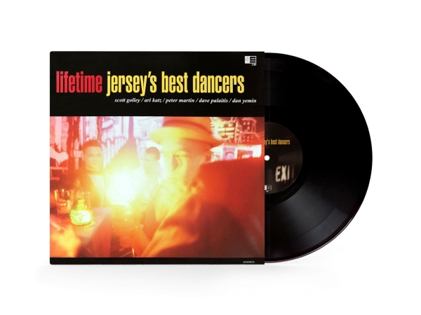
The Blue Note series reminds me of the work you did for Lifetime’s Jersey’s Best Dancers record. It’s in that same jazz spirit. Did you approach them with that stylistic cue, or did they already have that worked out in their heads by the time you collaborated? Also, was there a very specific cover that inspired that one?
An original draft of Jersey’s Best Dancers was a parody of Anthony Williams Life Time album cover on the Blue Note label (I posted this on Instagram recently). It was rejected, but I still wanted to take that Reid Miles aesthetic and run with it, so the second draft was less a straight up derivative, and something a bit more original. The direction was my idea.
***
See more of John Yates' work on his website. You can also follow him on Instagram.
***
Donate a few bucks to help with No Echo's operating costs:
***
Tagged: art spotlight