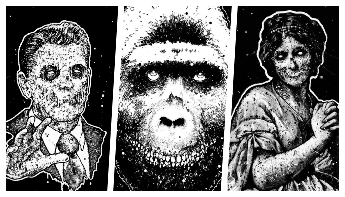
The real world is a dangerous place. One need not look any further than the nearest screen to verify that. Our modern society is a basket of snakes where those who hide their teeth the best, before inevitably devouring their competition, succeed. We live in a performative time where the duality of people’s public faces can be alarmingly unlike their private ones.
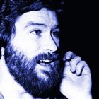
Not so in the art of Cris Crude.
In Crude’s work, people’s and institutions’ inner monsters are revealed in the jagged rictus seen on his subjects, the haze of noise they find themselves in reflecting the obvious violence of an outside world that tries its best to cover its tracks. Like the sunglasses in They Live!, Crude’s work lays bare the lies of society, but only in the coolest of ways.
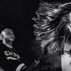
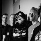
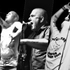
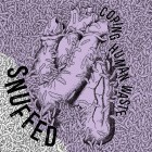
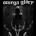
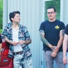
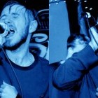
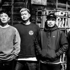
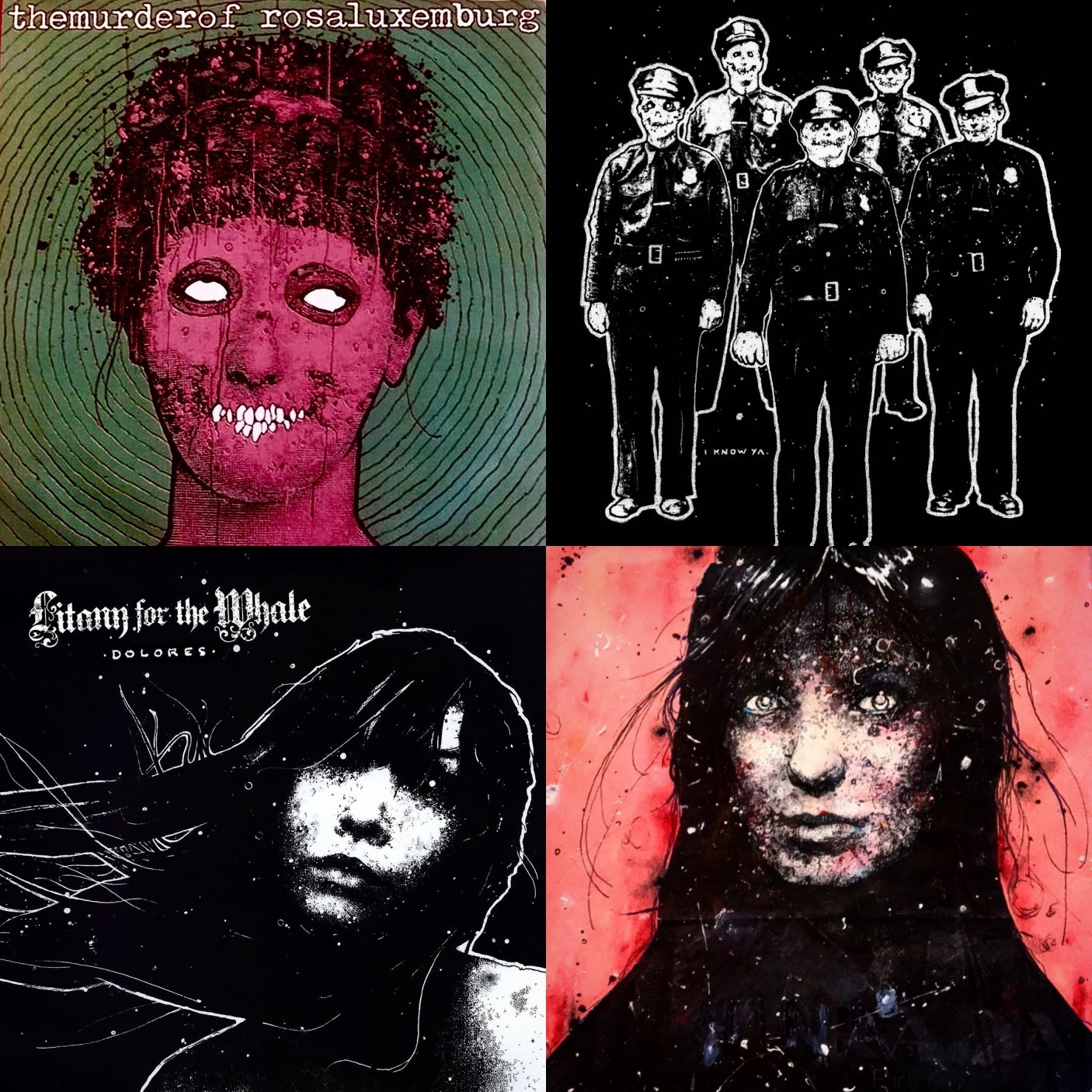
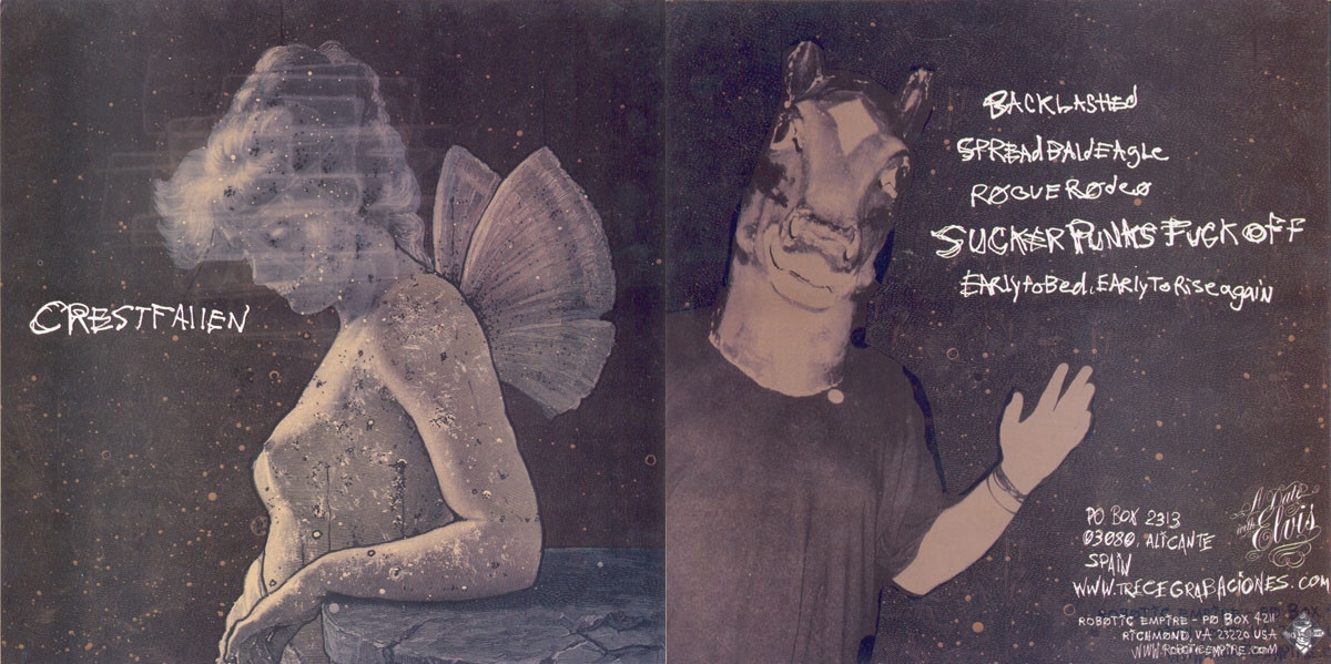
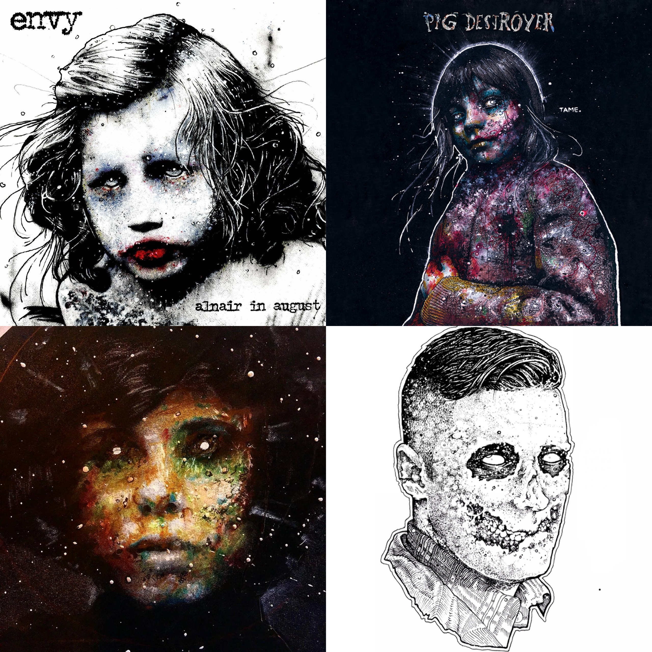
Cris Crude has been quietly helping shape the worlds of post-hardcore, screamo, and metal since the '90s. Whether through the transformative and influential rabidness pf Pg.99, the twinkly gruffness and hardcore-soaked folk of Pygmy Lush, his caustic new project Terminal Bliss, or his immediately recognizable imprint on album art from legendary outsider bands like Pig Destroyer, Darkest Hour, Portrayal of Guilt, and Planesmistakenforstars.
Your work has always held this frantic, dangerous quality--the worlds are full of static and discord, the figures' inner ugliness is often revealed literally, but there is a stillness and honesty in being able to read that chaos. How much do you think about theme in your work?
Quite a bit, but the themes and tone seem to be emergent, rather than pre determined, sometimes arriving way after a project is started. Sometimes way after its finished, and had time to soak in its own context, a theme will emerge, rather blatantly. But you always start with some basics; color, composition, light, contrast, etc., and those basics, harbor basic themes in them as well, for instance a project with high contrast, blown out, black and white feel, is gonna fit with some bands but not others.
Sometimes the piece will take on more meaning and have a better fit or vision after something in the process nudges it. It often can seem to become alive by way of the visual feedback you are getting as you work, telling you what to do next, like its talking to you. Mistakes informing intention. Eventually, and this is what i mean by “becomes alive” something happens where the image says “Do this next." And in a way tells you how it wants to be interpreted.. does that sound crazy?
A lot of your work I think really carried on a DIY punk tradition of iconoclasm—your subjects are defaced figures of authority or old mediators of beauty (paintings, statues, and victorian-influenced illustrations) and you have been known to use unconventional mediums.
Do you see yourself as part of the wider visual punk aesthetic and tradition? Were you influenced by other artists along the way or did you find your own process independently?
I see myself as a buoy bobbing in the wake of a large community of people, artists, writers, musicians that exist outside of convention. I am as much a part of it, as anyone else in that way. I, like many others have been harassed, lied to, incarcerated, and stolen from (cops) I’ve been bullied, misgendered, misdiagnosed, manipulated, and assaulted. (School, church, work, rehab.) Not just by one person, but really by a way of thinking.
I was drawn to DIY punk because I felt attacked by the outside world or somehow alien to it. It's this force feeding of discompassionate and inhumanistic ideologies, that reached critical mass in the field of my perception, and once I see the way things are, I cant unsee it.
A monolithic, multi-faceted, capitalistic hyper object; subconsciously, (as well as deliberately) designed, and tuned to pitch by our own dark nature, woven into the fabric of 60% of the western world, and there is seemingly nothing we can do to stop it. People working against that way of thinking have been around along time. I am very much a part of that. I was pissed off and destructive at first. Young and mad as hell, but bands, art and this community transmuted that anger into something tangible, something to build on, that exists outside of the monolith.
I started using Xerox machines as my primary medium initially as a communal event, the whole band would be there, it was fun, and we could make what ever we dreamed up. i learned from everyone I knew back then, like all my friends and people who’s work i admired and identified with. Tons of influences, too many to name, but most impactful among them were my little community of people, all exchanging ideas, methods, and good company, back when i started developing a style.
Also being from the DMV, I’m curious; did your upbringing or growing up in Virginia have a huge affect on your aesthetic as you developed it?
Im not really sure if it did, if so it was only in this “Norman Rockwell meets the Addams Family” sort of way. There was a dark underbelly I’d come to find, in almost every small town I’ve lived in. My mom raised us by herself until we were about 5-6 moving us from Fairifax, Stafford, Norfolk to Canton, OH, and eventually Reston, VA, and after meeting our stepdad, we finally settled in Sterling Park.
The 3 of us being a formally nomadic 3-piece, now a newly minted nuclear family, had our fair share of growing pains. Our new dad was a disciplinarian, and a former Marine, with a scary temper. Sterling Park was right next to Dulles International Airport, so I suppose it wasn’t too far out there, but it felt like a real small town in the early years, a very “Any American Life 1987,” if that makes any sense.
But just beneath the surface, it had all these dark little corners.....A body being found in the woods behind Park View High School, someone hanging themselves in the woods behind 7-11. Little brats killing cats in the apartments across the street. Our neighbors daughter waking us up at 1am covered in blood crying.
Sterling Park bordered farmland back then, and had this insulated feel, a place where nothing escapes, or a place where something could hide...a happy mask, so to speak, with something scary underneath. Something like that probably snuck its way in my subconscious and started playing out when I finally started drawing.
Did you discover you had an aptitude for art as a kid? Or was it while you were discovering independent music?
I did, and I always drew. I didn’t talk a lot as a kid and was very introverted, I got held back in 2nd grade, essentially for daydreaming. So I spent a lot of time in my head, and a lot of time just scribbling and doodling on my homework, or on little scrap pieces of paper. When I was around 10-years-old, after seeing that I had made up my own comic strip, my mom hired a cartoonist to draw with me for a couple of months.
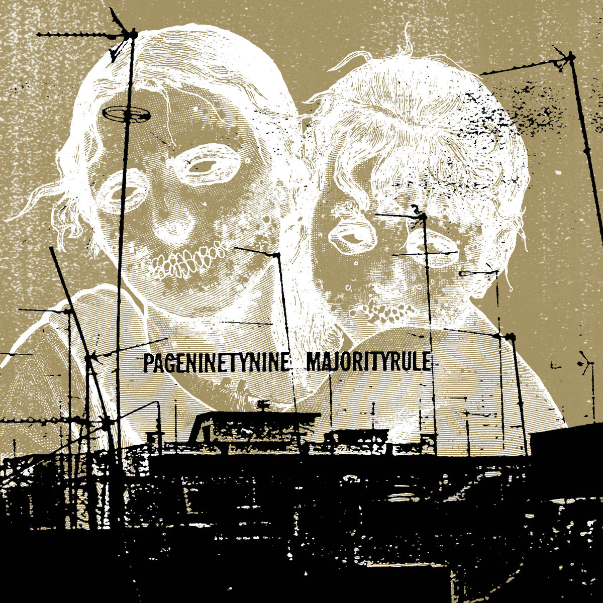
Around this time, I really started to take drawing seriously and trying to improve. I won a few local awards before I got to high school, and really, I always thought that something involving the arts, is what I would eventually do for a living. As Mike and I started playing in bands, I ended up doing a lot of flyer art, and then later on album covers for pageninetynine.
We both got expelled from our home school and the high school we ended up at didn’t have an art program. Just gym and shop. So graffiti and band-related art was really the only outlet I had at the time. Much later on after I did pageninetynine's Document #8 I started drawing interest from other bands. I met a lot of cool people in the 5 years pageninetynine existed and it certainly played a major role in the opportunities I received, both at first and later on.
Was there sort of a positive feedback loop between your musical expression in Pg.99 and your visual art?
I don’t think my art ever informed the music of pageninetynine, but I do think the art was a reflection of it. Writing lyrics and making album art, are surprisingly different processes, for me, although very closely related in the final outcome. It dawns on me now that they never really crossed paths creatively, like I never wrote a lyric about cow skulls and roses, but there is shared imagery, I suppose.
My brother and I always tried to convey or project something “unsettling” in both the art and the music.
Were there specific artists, designers, albums, or approaches to band branding that helped shape your idea of how to address it the way you do?
Strangely enough, graffiti, I think, has had a bigger influence on my style or process than I normally give it credit for, just outlining portraits was what I was already doing under bridges and jersey walls in high school. So the transistion from that to band art was really seamless, not by making album art that looks like a Beastie Boys record, but by using the same principles of it.
Graffiti and '80s punk kind of share the same aesthetic in a way, strong outlines and blasted out contrast. As far as band branding, while no one my age who grew up punk wants to admit to trying to brand their punk band, no one was a stranger to band branding back then no matter how cool you said you were. If you have a Black Flag tattoo, it's a product of successful branding. I don’t think anyone ever talked about it, but i think in the end as an artist, you want to come up with stuff that is visually symbolic of the band and rememberable.
In that sense, the Black Flag bars are brilliant, the Crimson Ghost is a brilliant logo. It pops, its simple, easy to tattoo. Love it. It’s strange as a musician i want album art to be vague and almost forgettable, but as an artist I want the opposite. That said, I always liked the way Raymond Pettibon and Pushead covers were recognizable from across the room, and if the band used them enough, it gave them a sort continuum, or inherent brand.
Nowadays its very commonplace, and I almost hate that I think like this now, but if I’m honest, it's always been in the back of my head, about the art I’ve done for my bands, and others. Sam McPheeters from Born Against is another huge influence. Continuity is important to me. Things that pop out at you, things that are dark, simple and relatable.
A lot of the clients you work with, while undeniable legends, tend to be bands that are particularly niche—they tend to be really interesting and amazing bands that sort of exist a bit on the outside or fringes of the scene. Is this just natural? Do you see there being a correlation between the bands that are interested in your work?
I hadn’t really thought about it that way, to be honest. I think it is natural, yes. So many of these bands are friends of mine though, so more than anything I think that has always been my default common factor that ties them together. But if you took that out, and did a little psychological dossier on all the bands, I’d say the common tie would be that niche fit in the ”outsider profile." Spotlight adjacent. Corner-some.
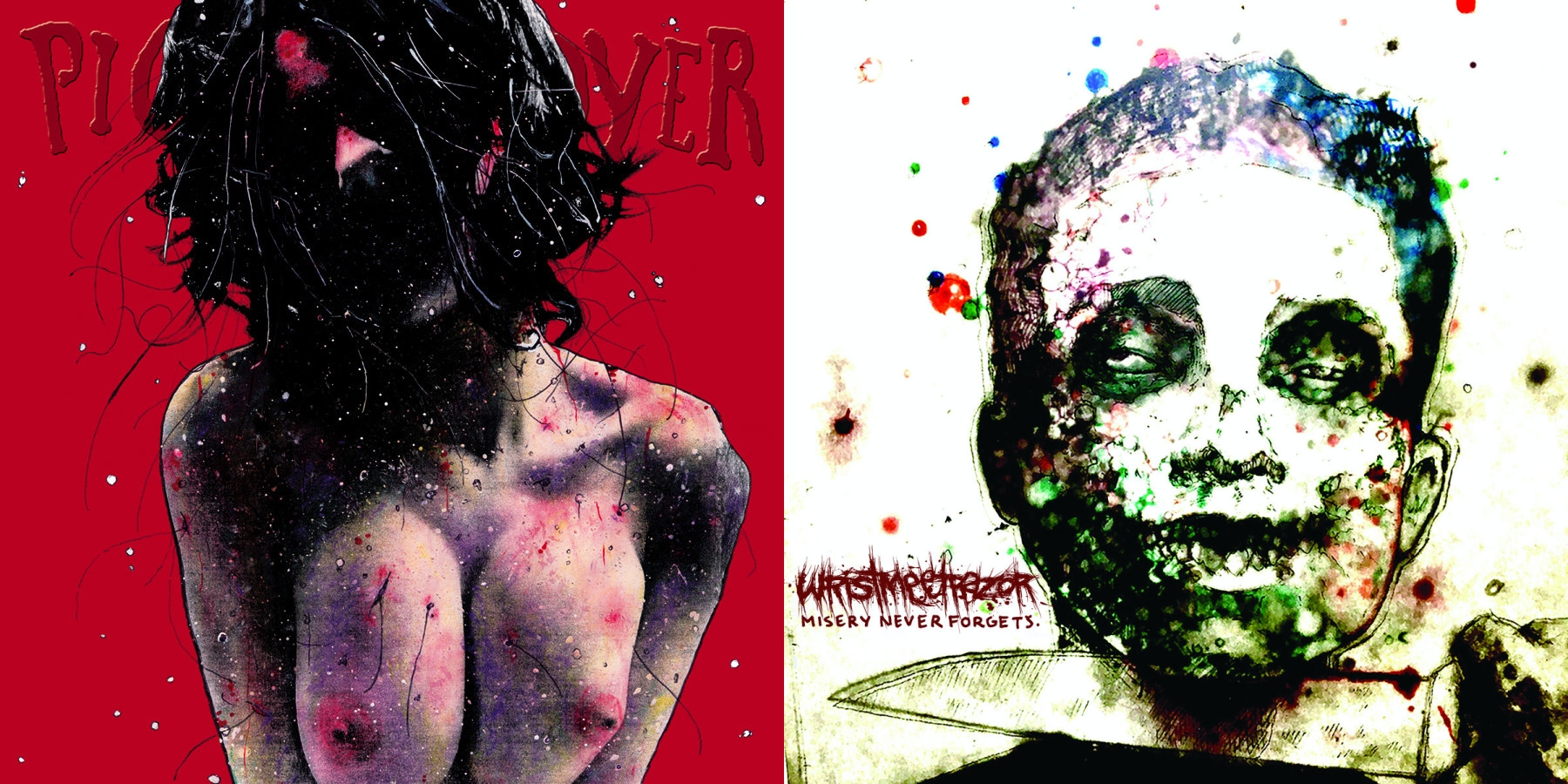
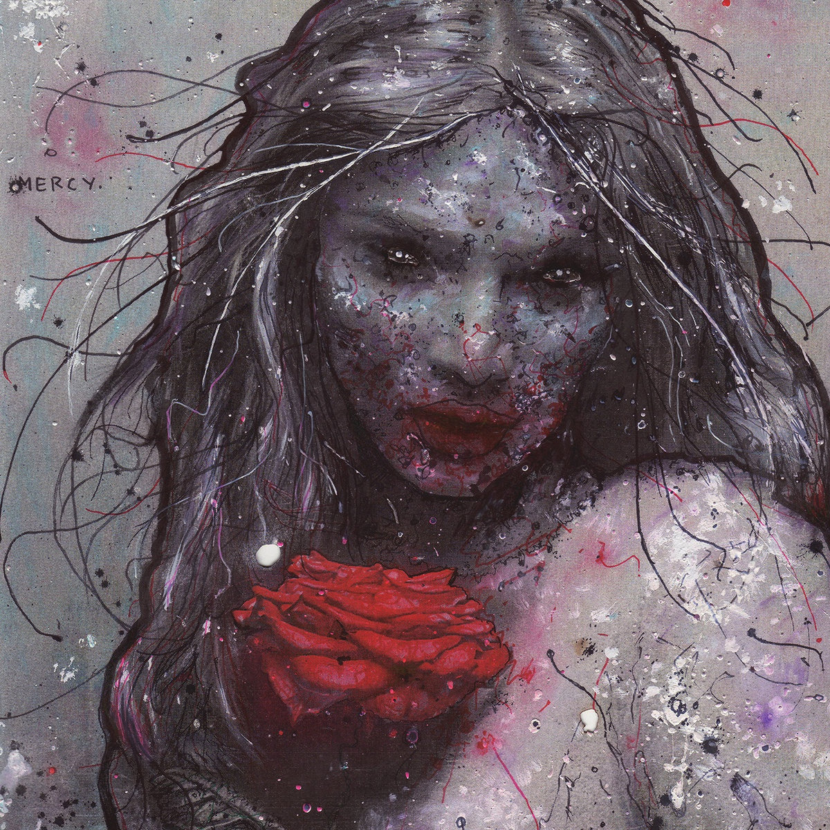
Planes Mistaken for Stars' Mercy is one of my favorite records of all time. The older I get, the more i just adore everything about it, but my first exposure to it was how gorgeous and sort of inscrutable the cover was. How did you approach that project?
Thank you! Originally during our first talks, [Singer/guitarist] Gared [O’Donnell] had a full body in mind, and similar colors to what we used, a sort of a watery dreamy type thing. I hink he described the feel of it very well, and really led the way for the overall tone of the cover.
I remember having to kinda convince him to let me do a portrait, and he really encouraged me to give his idea a try. I did but I never showed him cause I hated it, so much had to go right for me to do a whole body justice at that point, and I was fresh off of [Pig Destroyer's] Terrifyer, so I wanted this impact, and continuity with the projects I was working on, my thought was portraits are immediately relatable, and felt I could make something feel like what he was describing, and ended up doing something much closer to his original idea on the back of that record.
I think we both really like how it ended up. At least i hope (get well soon, Gared!) I have tremendous respect for that band, the van was jamming them quite a bit in our touring days, played with them a few times, great guys. Its a really big deal for me when a band has enough respect of my work to be bold enough to to keep their own name off the cover, same with label for that matter.
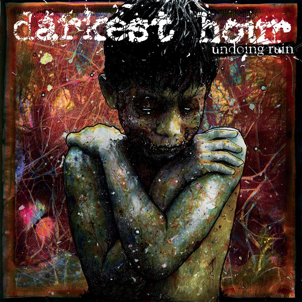
Darkest Hour's Undoing Ruin was probably the very first time I saw your work at all, though I didn't know it at the time, and was for a pretty big label in our scene. How did that cover come about?
The Darkest Hour guys are local to our area, and we all have a lot of mutual friends, so inevitably we played shows together and also became friends. [Darkest Hour guitarist] Mike Schleibaum contacted me, told me to name my price, and let me have full reign. Which blew my mind at the time. Not many people at that point had ever given me full say on how the record would look, and certainly I’d never gotten to pick my rate at that point. If anyone offered me any money at the time, I’d probably do it.
The only contact from Victory [Records] was the check. I was living above my partner's family bakery at the time, in a cinder brick building with no windows, working there, and out on a farm. In your 20s everything you make has this feeling of growth, like it's all building upon the last thing you did.
So, I wanted to experiment more with color and was looking for ways to get unusual effects, with transparencies, and a friend of mine showed me how to pull apart a developing Polaroid, and manipulate it. This great thing happens; The colors warp and saturate, they invert, negative spaces are created when the 2 sides completely overexpose. Things like little rivers and branches show up, little graph like lines turn out to be finger prints. Really cool effect, depends on temperature, humidity, light, how oily your fingers are...total analog chance. Just like us!
Anyway, one of the Polaroids I took stood out, it was some bramble at the farm, it had all these great natural flowing lines, the color pulled apart almost perfectly but also fit the colors I was using on the main image, so it became the background. That was fun. I wanna do more of those now.
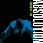
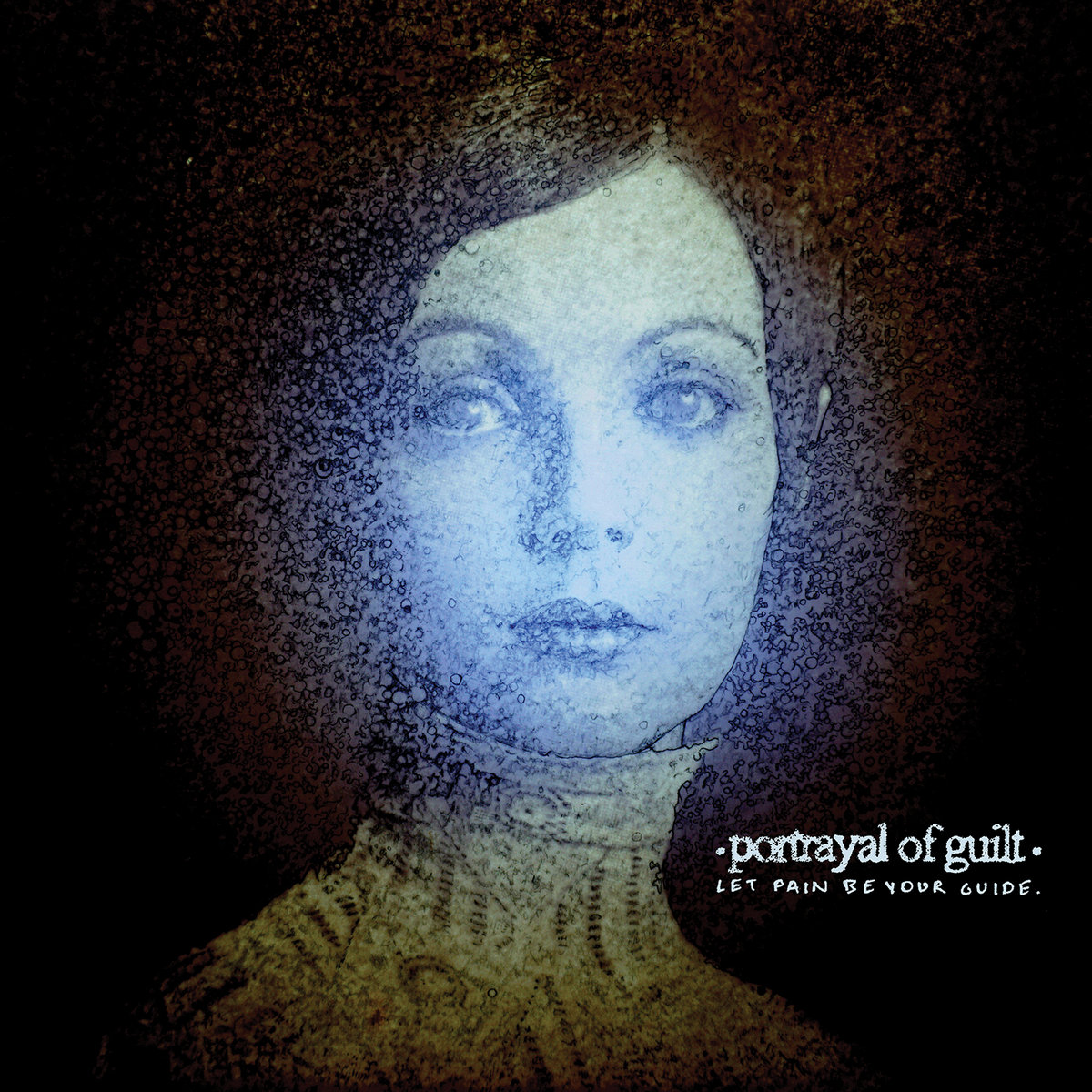
The biggest departure in your portfolio that I can see is Portrayal of Guilt's first full-length album, Let Pain Be Your Guide. It's a much quieter cover in general with this really desolate, lonely feel to it. What helped dictate that change of approach (if indeed there was one)?
Regarding the departure, its really a matter of circumstance. That summer while working on it, my dad got sick and passed away. Such a tough time. It left a gaping hole in our family. I had moved back home to help my mom with things. He was a steady stoic presence for our family, and even though we butted heads when I was younger, he really smoothed out, and calmed down as he got older. I was just stunned.
My partner and I at the time had split up a few months prior, and I spent the downtime working on the cover and visiting my dad in the hospital. He died 2 days before my birthday on Father’s Day, alone in a hospital in DC. We went and visited him almost everyday prior, especially my mom, but for whatever reason he passed on the one day we weren’t there...it was a heavy heavy weight that settled in his absence, there is a lot of stuff that needs to happen after a family member dies that is just bureaucratic bullshit, but absolutely necessary and urgent..moving accounts, insurance, pension, social security, switching car titles, a funeral.
A month later, our family dog passed (his dog), and 4 months later my dad's brother, my uncle Ray, passed. It was a very strange time. I felt disembodied. Weirdly calm amongst all this tangled up grief. I felt I had to hold steady for my mom. I remember telling people my grief was like a tangled up ball just following me everywhere. When he was still alive I would show him what I was drawing for that cover and he’d say, "Man, that is neat,” which is about as far as he would go for critique.
I got back to work a day after Father’s Day, and just kept zooming in closer and closer, building noisy texture around the portrait, using the details and absorption that comes with it to cope with the grief. Ask any illustrator if they’ve ever drawn themselves into a rabbit hole, and they will know what I did to myself, it would take me 4 hours to finish a 2-inch space. But it was a relief, when I zoomed into those little spots, my mind was quiet, I would lose track of time. I could escape my reality for a little while. And I know its quite literal, but i kinda hung onto the title of that record. Let Pain Be Your Guide felt like a sign from him, and what else was I gonna use to get this record done. Pain was abundant. What else was I gonna use to guide me? So much of what we create is a reflection of our circumstance. The output, undoubtedly a product of the input. I think that was the case here as well.
How do deal with notes or feedback from clients?
Usually people pitch me in two ways: they have a very specific thing they want, like, "Make us all dead” or “Make my wedding picture zombified," to which the feedback after I’m done is usually something like “Fuck yeah, dude." These clients know exactly what they are going to get and what they want. They may ask for small adjustments, but generally speaking these clients and I don’t really communicate until after the commission is done.
The other way is a theme or a tone, the band, or client wants to convey. A vision...so to speak. With these clients, I usually ask for a visual reference or description, of this vision, along with lyrics and music, if its a band. I also may ask if there is a dominant color they are looking for. It is during these conversations that I can usually tell if I am going to be a good fit for the project, If it doesn’t seem like i can do what they are asking, I will let them know at that point, so they can find an artist that better suits what they are looking for. Still, most times after giving me some references, they leave it up to me. I take the gestalt I get from the lyrics, tones, color, and conversations, and I use that to experiment, usually doing several mock ups, each one slightly different until I think the composition can stand on its own.
Once the composition is approved, the client and I whittle down small details, mostly dealing with color or things like title or logo placement. After that, I start on my final stretch of detail, which is actually where the bulk of the work is. Either way, I always ask up front, which work drew them to me, which helps me get closer to what they ultimately wanna see.
I am perfectly happy doing little tweaks to this kind of work, but i usually have a relationship with a piece once i start to develop it, and can be stubborn about things that effect the overall tone. I almost always end up working with people familiar with my stuff, and generally speaking, friends, and fans of my stuff, so the feedback is almost always positive.
Any dream projects or clients you want to put out into the universe?
I’d really like to do some work for Deathwaltz or Mondo, and try my hand at some soundtrack album covers, where I can take content from horror movies and put my own spin on it. My brother collects records and his soundtrack collection is growing and is a huge thing for him right now.
So, if I got like a Texas Chainsaw Massacre cover, or something like that to do, I would be ecstatic. (Spencer, if your reading this, call me, maybe?)
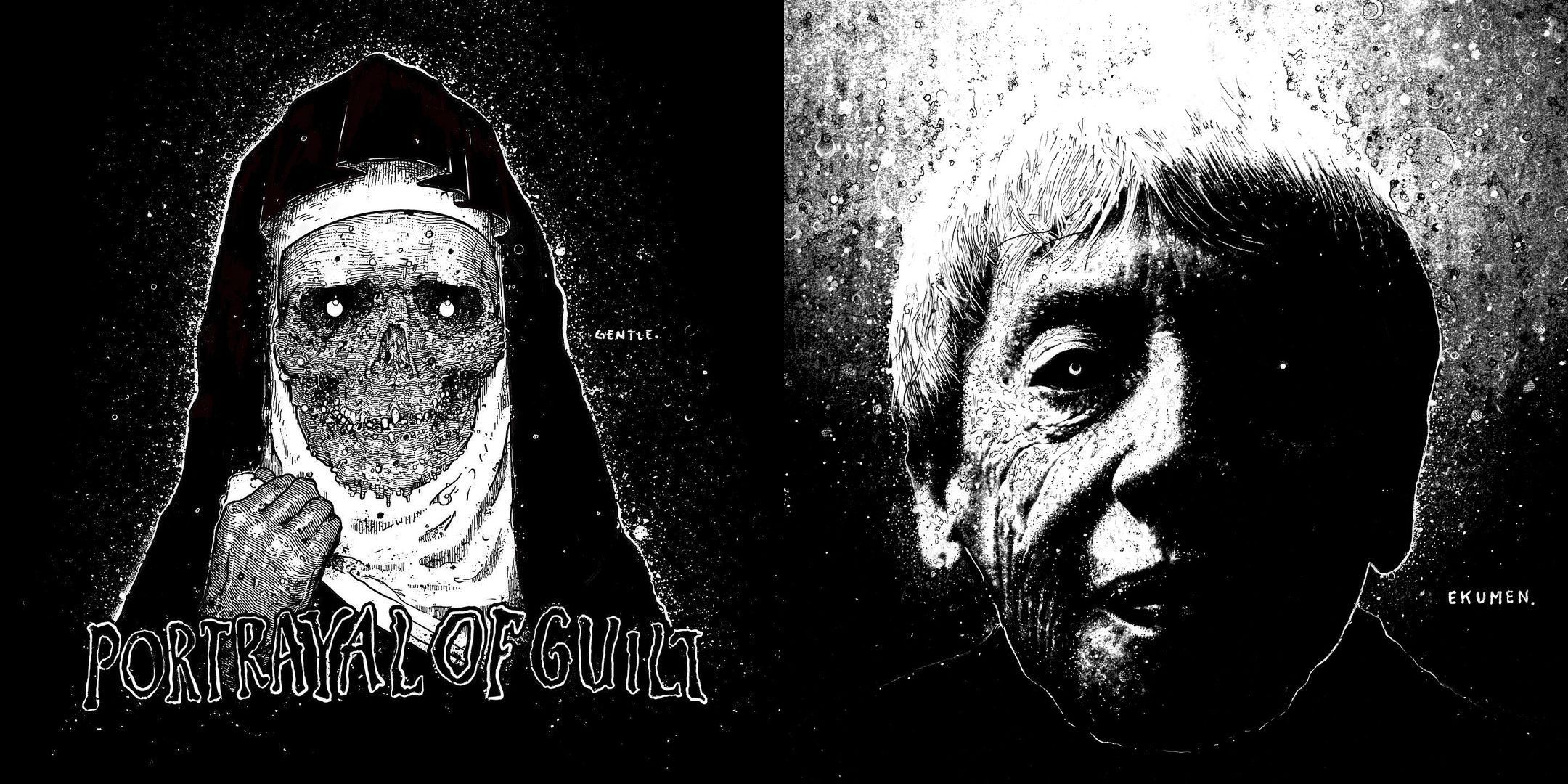
Earlier this year, Cris put out a new music project in the fantastic punk/grind of Terminal Bliss’ Brute Err/ata. Read No Echo's album review (and listen above). His work graces the cover of Portrayal of Guilt's latest full-length, We Are Always Alone.
Lastly, Planes Mistaken for Stars' Gared O’Donnell is battling Stage 3 esophageal cancer and you can contribute to his GoFundMe here.
***
See more of Cris Crude's work on his Instagram page.
***
Help Support What No Echo Does via Patreon:
***
Tagged: art spotlight, cris crude, pg.99, portrayal of guilt, pygmy lush, terminal bliss