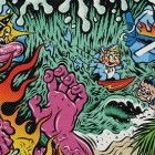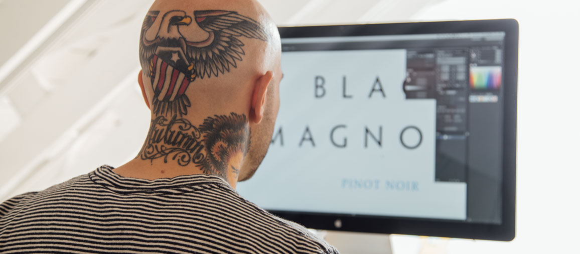
Looking at Ryan Clark’s Invisible Creature portfolio gives one pangs of pride and awe in terms of the breadth of where the hardcore scene has touched.
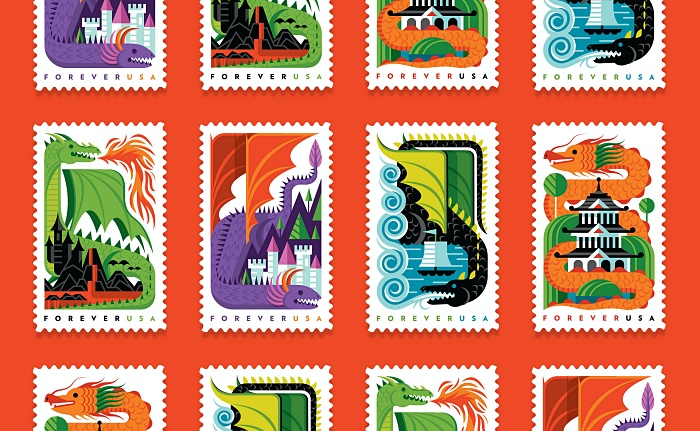
The Washington-based artist's more whimsical work has graced everything from USPS stamps to Target gift cards to murals at WeWork, but Ryan, perhaps even better known for his work as vocalist in the metalcore act Demon Hunter, has had a potent and fervent influence on the hardcore scene through his work on album covers for the likes of August Burns Red, Norma Jean, and The Chariot.
Along with his brother and business partner, fellow artist Don Clark, Ryan's work has always been slightly out of the norm for the metal scene. In the '00s, Solid State Records’ oeuvre began to adopt a forward-thinking art direction, incorporating a lot of photography and photomanipulation into their aesthetic.
But even amongst an already interestingly curious selection of album cover art, Ryan’s work stands out for its almost storybook appearance that cant quite be pinned down. It’s Eric Carle by way of Jacob Bannon, but even that doesn’t do justice to Ryan’s innate and inherent flare for design.
Ryan''s compositions are clear, bright, and intuitive, his hand as easily practiced at photomanipulation and collage as it is at typography and illustration. It’s very little surprise, looking not only at the caliber of his work and clients as well as his understated commercial style, that he may be the most successful graphic designer the hardcore scene has yet birthed.
Having worked with names and brands and bands from all over the map in terms of impact and recognition, what aspects do you enjoy about working with someone like Alice in Chains or Kendrick Lamar versus a smaller act like...for example The Chariot who might only be huge within our scene?
In my experience—not all, but most of the time—the bigger the artist, the more difficult. However, the factors that contribute to those differences aren’t exactly what you’d assume.
Bigger, major label artists usually come with a greater number of people involved. You know what they say about cooks and kitchens. When the artist does not have 100% control/say over decision-making, things get dicey. Managers and label reps all have their own agendas, and whether they realize it or not, they’re easy to spot. When artists listen to—and trust—the opinions of their personnel, it can really, really slow the process.
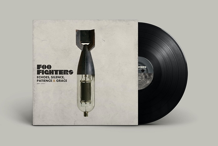
The bigger artists also seem to function on longer timelines. There are few things worse for a project than too much lead time. Every project with a tight deadline goes much smoother for the simple fact that no one involved has the time to scrutinize or the audacity to expect a dozen iterations. When time is of the essence, decisions get made and they stay that way. I love it.
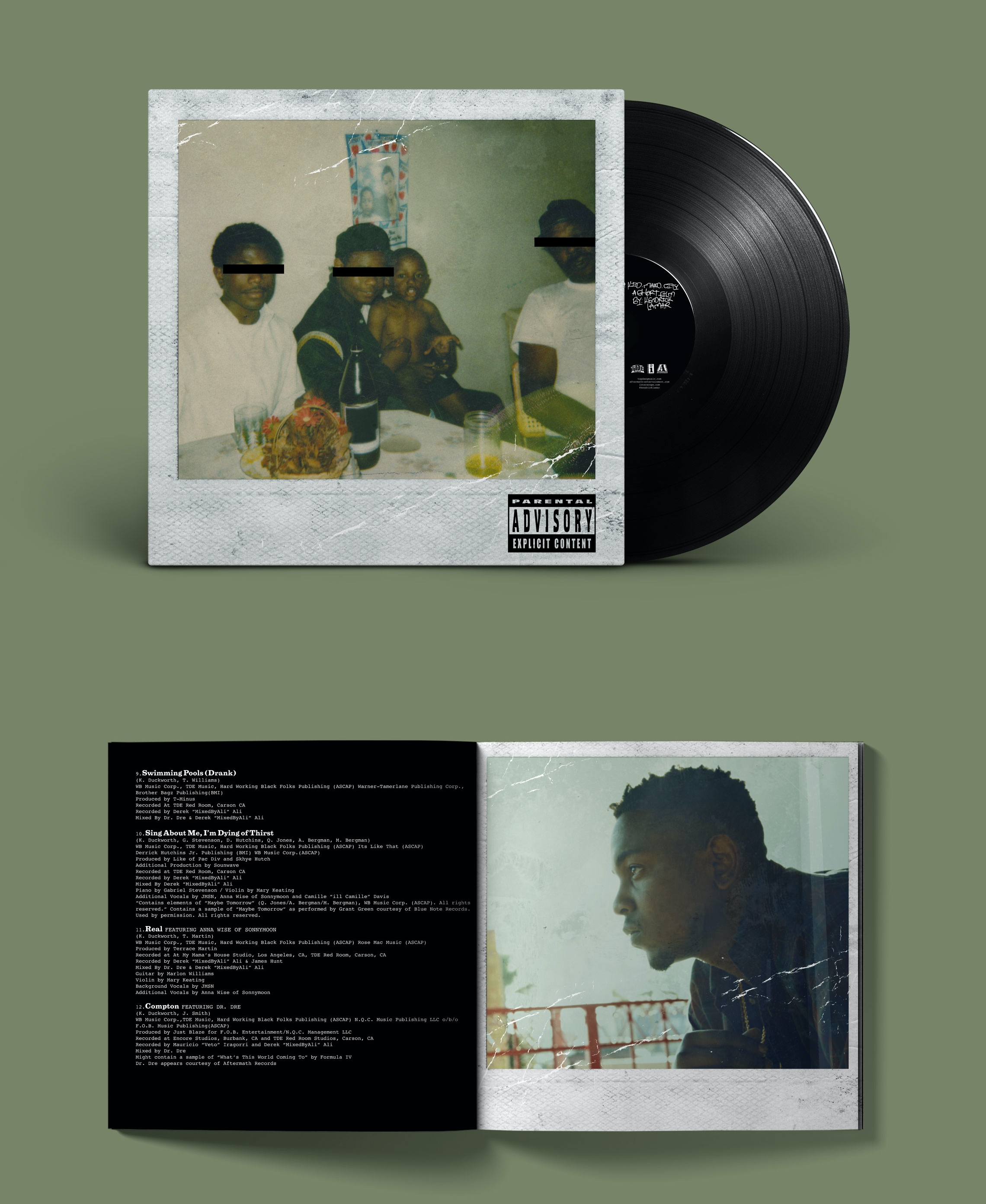
Smaller artists usually run their own show, and this helps. Big-time management and artist reps try to validate their involvement, so less of that usually means less pointless revision. However, smaller artists are also more likely to function as democracies. This is the worst instance of all.
Without fail, there will always be one member whose opinions oppose the majority. No band should ever function this way. It’s always to the detriment of the overall aesthetic. Choose a member to make visual/aesthetic decisions, and everything will end up looking better and making more sense.
There’s also something to say for the bigger artist's tendency to think of themselves as more well-rounded artists than they are. Smaller artists—in theory—should be more humble, which leads to healthy respect. They’re also more likely to be familiar with me and my work… and that goes a long way.
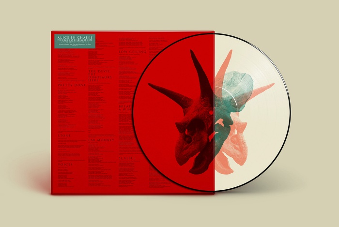
Do you have any album covers/bands/brands which really had an impact on you while you were developing as an artist and designer that influenced your thinking about the medium?
When I was a kid, it was all about skateboard graphics. The decks illustrated by Jim Phillips Studio and VC Johnson for Santa Cruz and Powell Peralta, respectively, were the first “designs” to blow me away on any level. I have 20 of those decks hanging in my office today as a reminder of my first love(s).
In my teen years, my attention shifted to graffiti. Twist—or Barry McGee as we know him now—was major for me. Artists like Hesh, Daim, Cope2, Minus, and Kaws (before he started selling toys) were who I was looking up to at the time. Later in that period, it was guys like Sheppard, etc. The neo graffiti era was when I sorta began to duck out.
In 2000, when I started getting into graphic design, it was all about guys like Storm Thorgerson, Vaughan Oliver, Peter Saville, Dirk Rudolph, PR Brown, and Stefan Sagmeister. These guys were the greatest when it came to design for music, and they inspired us to push the limitations set by the standard CD format.
I’m glad to have become a designer after the ubiquity of the cassette, but CDs came with plenty of shortcomings to navigate. Seeing how other people solved those problems in unique and interesting ways made the format seem much cooler than it actually was.

You started working with August Burns Red with Messengers, but Constellations seems to have been the start of a major cohesive and stylistic turning point--what has helped shape that visual language over the years you have collaborated with them?
What was your guiding light through those projects? (the really painterly, illustrative art for Rescue & Restore being my favorite). How do you make an oeuvre feel cohesive while still allowing for freedom and experimentation?
I actually started with August Burns Red on Thrill Seeker. Asterik Studio was Invisible Creature prior to 2006.
With this band in particular, there were three key components that seemed to be present every time we worked together:
- JB was the point of contact and the decision-maker. It streamlined the art process.
- They never wanted to do the typical “metal” thing, visually-speaking. That instantly pushed my thinking outside the box.
- They always trusted me. They understood that the music was what they knew best, and the art is what I knew best. There was an inherent trust from the beginning.
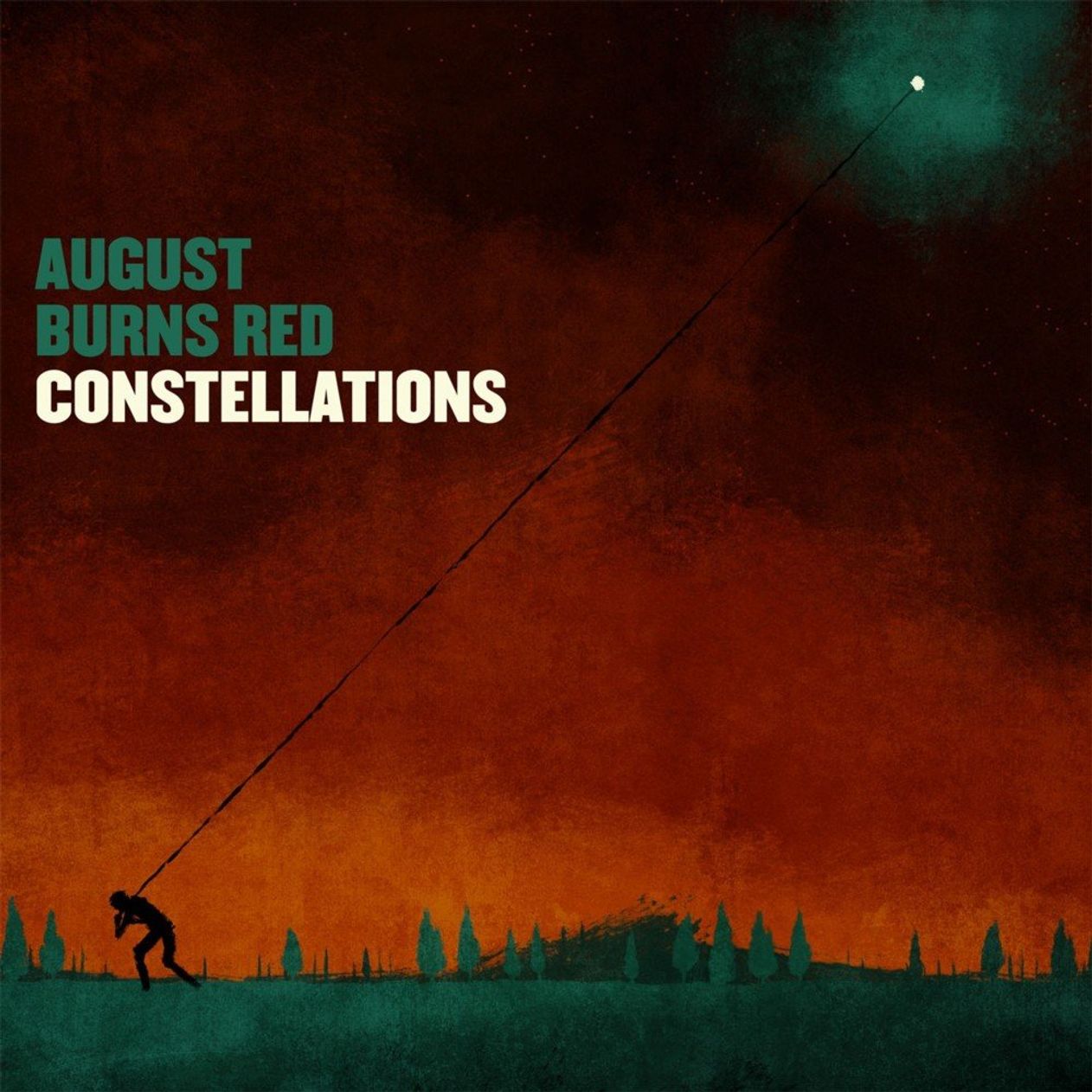
The thematic concept for Constellations came from the band. The idea of someone pulling a star from the sky was theirs. The painterly style was just my way of making it less predictable. I had dabbled in acrylic painting for years, and though my skills in this area were limited, I knew that I wanted the album artwork to look simplistic regardless. I believe this artwork was the catalyst for quite a few projects in the future which were built using this same technique.
In essence, I paint every single shape individually on a few pieces of paper. I scan everything in… and I composite everything in Photoshop. This gives me maximum flex and edibility with the orientation of each piece, the nuance of color, and the way things overlay. It’s like “painting" with unlimited forgiveness.
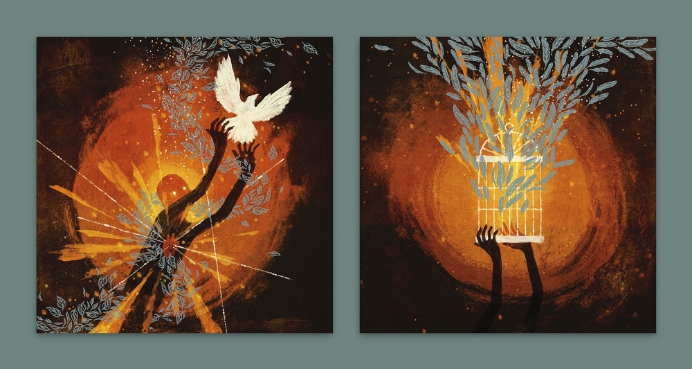
Rescue & Restore is also my favorite of the August Burns Red record designs. This was clearly a much more matured version of that same painted style. However, in this instance, I added an additional layer of pen and ink, which I think really pushed it to the next level. All of the shapes and ideas were things I was very comfortable executing, so it was a very fun endeavor overall.
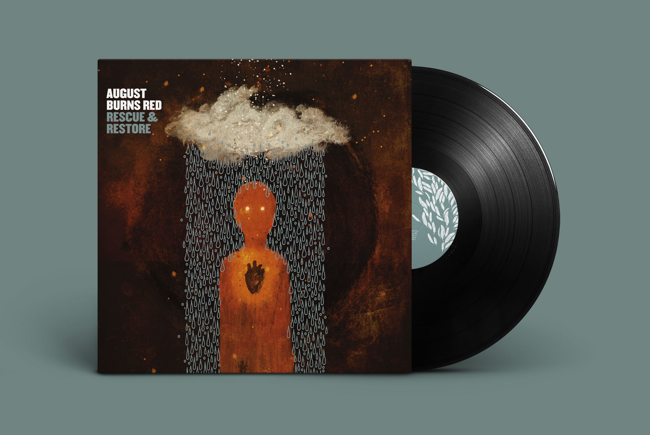
It also helps to have time to do projects like these. That doesn’t happen as often anymore. When I’m given trust plus ample time (not just from the client in question, but by the miraculous alignment of all other projects on my plate), amazing things are ought to happen.
You work on both The Fiancée and O' God, the Aftermath (the latter of which's booklet has sat on my work desk for years as an inspiration, next to Bleeding Through's The Truth) both have this really incredible typographic quality. How were those projects pitched and how did they evolve? Especially when you are collaborating with outside artists/photographers?
The projects you mentioned above are two of the most time-consuming pieces I’ve ever created. However, work for The Chariot always came easy(er). That is, Josh was always willing to give me his full trust. Norma Jean was unfortunately never as idyllic.
Norma Jean came first, so I’ll start with that one.
At the time, the band was all but sold on the idea of using some of Daniel’s (the band’s drummer) collage work. His work has always been cool, but I was determined to manifest the idea that I was seeing in my head at the time, which was influenced by the album’s amalgamated song titles.
I pushed and pushed to see it through my way, and the band finally agreed. However, we lost precious time throughout this process, so I had to work quickly.
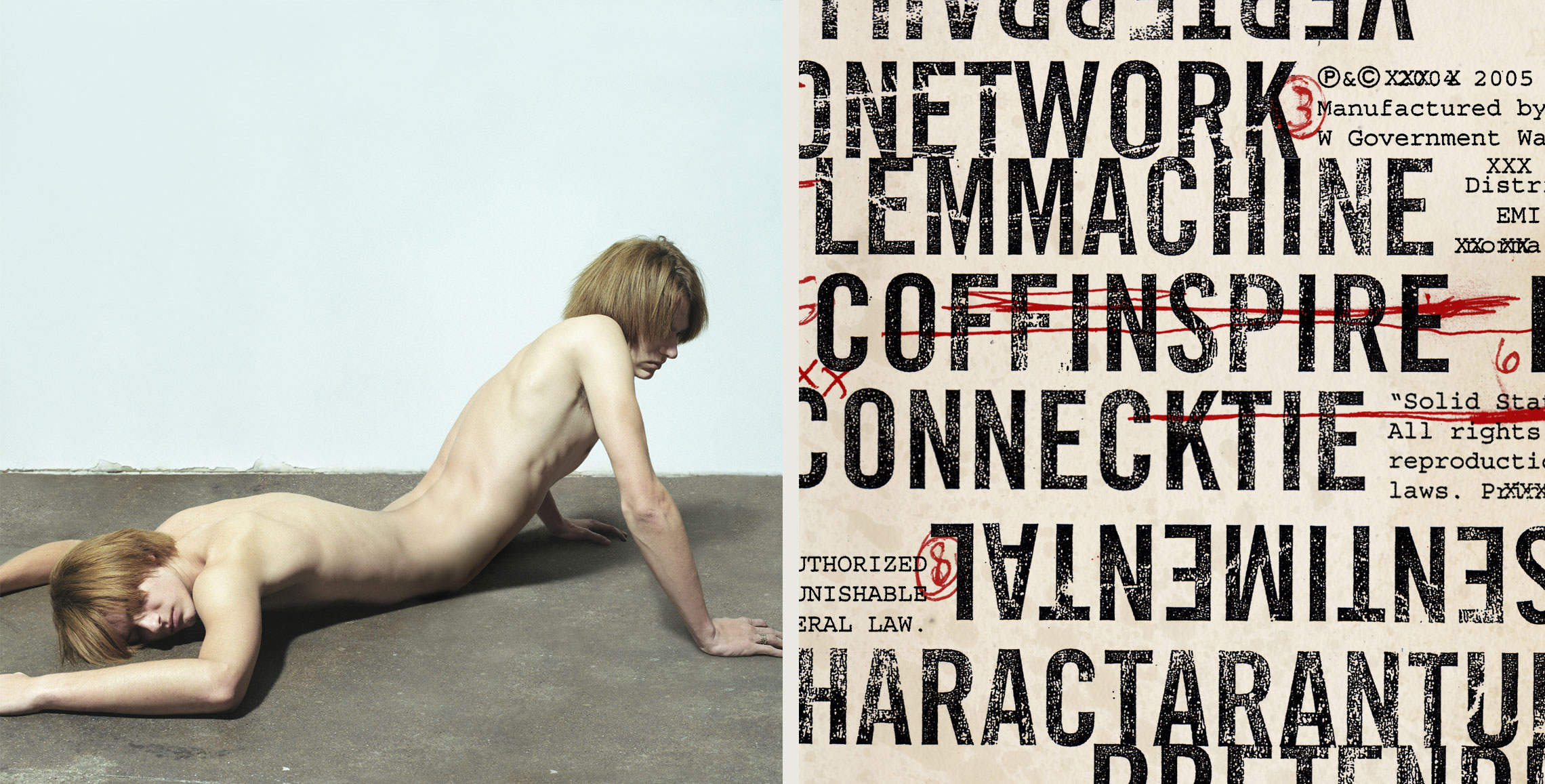
I mocked up each photo concept with a crappy old phone camera, and sent it over to our then go-to photographer, Jeff Gros. He shot the images as quickly as he could. In the meantime, I worked on the typography, which took nearly as long as the arduous Photoshop compositing that would come later. I typed out the lyrics… doubling up certain words or lines so that I could—in turn—cross them out. I also had to go through and purposefully misspell things so that later crossing them out would appear to be done deliberately.
Some pieces I crossed out with Xs, the way you would with a typewriter, and others with crude, hand-drawn, red lines. Each layer was printed out, photocopied a half dozen times to distress, scanned back in, and composited.
The type was to be as gritty as possible to juxtapose the crisp, clean photography. To take it a step further, the paper stocks would be a mix of coated and uncoated, emphasizing this concept of duality.
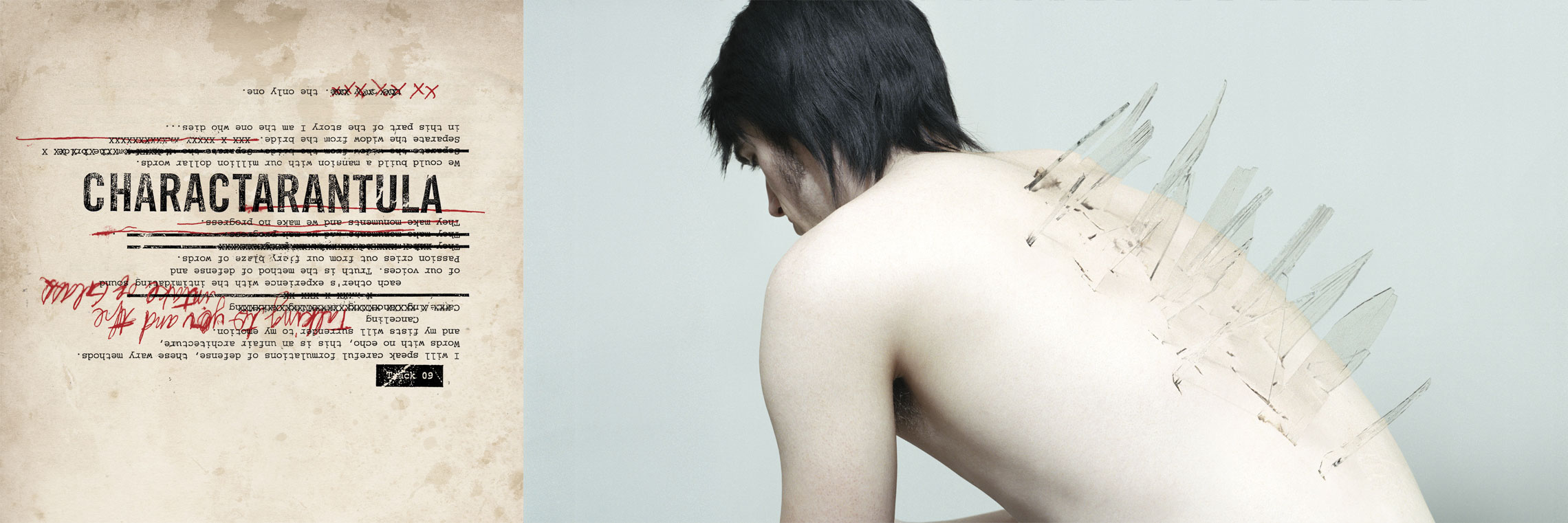
This package resulted in my first Grammy nomination, and believe it or not, I had to later fight—once again—to be the person that would design the special edition of the same album.
As for The Fiancée, things went a lot smoother, but still took an insane amount of time to execute.
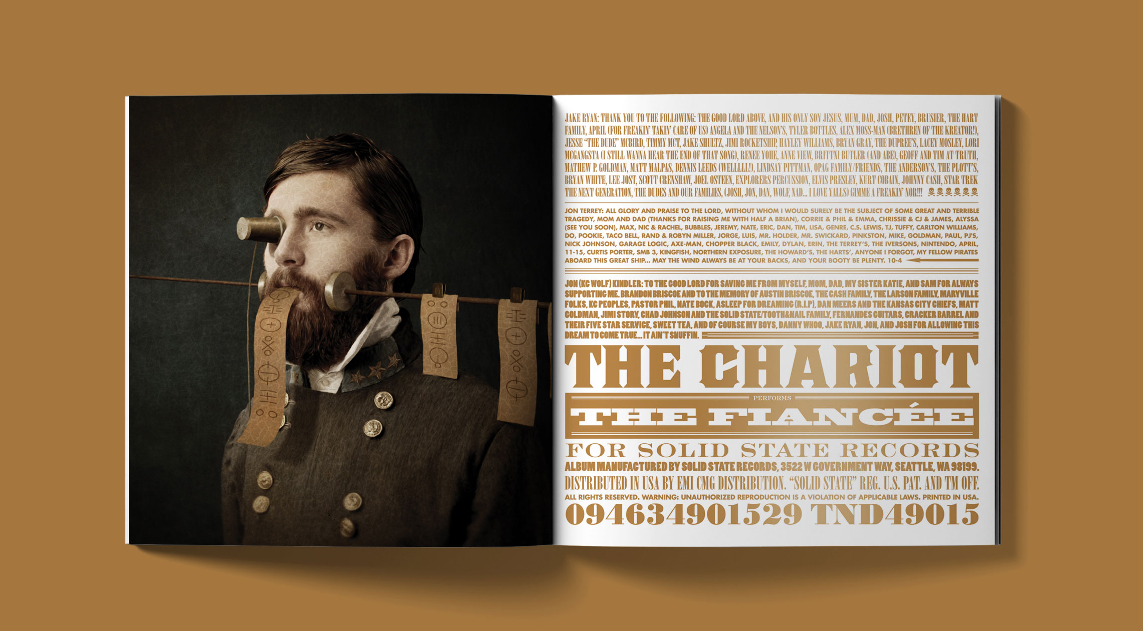
The band had these incredible portraits taken, where they appeared to exist in another time. The concept started to blossom quickly based on this aesthetic, which could be categorized as early 19th century, the steam age, vaudevillian, etc. The ornate and eclectic nature of the signage and advertising of the time was the catalyst for the typography within this album package.
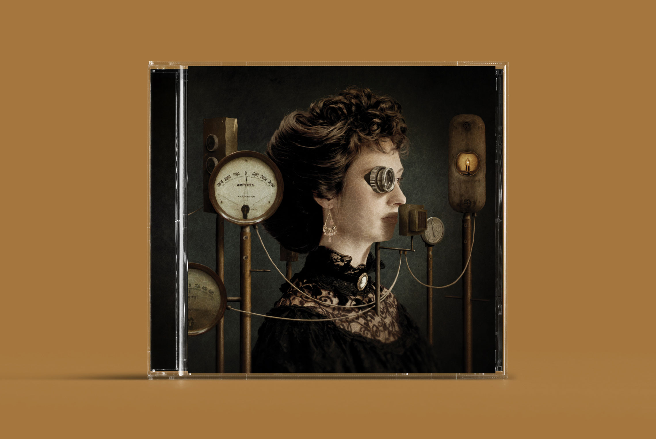
I selected a handful of typefaces to move between, and attempted to utilize them in a fashion that felt like a modernized version of what once was. The copper metallic ink added an element that again felt equal parts old and new.
The Photoshop work on these images was brutal. Not only did I composite all of these random objects into the portraits of the band members, but once this aspect was finished, I used a brush to smear the entirety of a flattened version of the image in Photoshop.
I wanted to essentially turn each image into realistic-looking paintings. The cracked canvas texture applied over the finished image helped legitimize the look.
The processes for these projects were quite different, but both signify a time when I laboriously toiled to create something that looked as amazing as it did tedious.
Your own band, Demon Hunter, has one of my favorite visual themes. The infinite variation within controlled parameters take is something that I have always thought is this really awesome, understated thoughtfulness.
But, from what I can tell from Discogs, the design and illustration you have collaborated much of the time with other artists and studios like Asterisk--what influenced that (if indeed its true) and how do you, as a designer and artist yourself, mitigate your expectations when working with another artist on your passion?
Well, as I mentioned above, Asterik was our studio prior to starting Invisible Creature, so we were responsible for the design and art direction from the beginning. The first two covers were actually designed by Kris McCaddon who—at the time—was not only in the band, but worked with me in the Tooth & Nail art department.
Kris always had a phenomenal background in Photoshop wizardry, having worked under PR Brown for a number of years… so when Kris began working with me at T&N, he was a wealth of knowledge for me in that regard.
By the time Demon Hunter had enough promise and momentum to afford to look outside for artwork, we began to dream of working with fine artists whose skills were far beyond what we were capable of creating ourselves. To me, playing art director to some of my favorite fine artists—as it relates to DH—is much cooler than trying to do it all myself. I’m far too critical of my own work, so I’d rather not play that game when it comes to my own band.
The first person I reached out to—for the creation of the artwork for The Triptych—was Pushead. But Pushead is notoriously reclusive, so after receiving no response at all, we hit up metal’s resident master painter, Dan Seagrave.
Dan created three amazing cover paintings for that album, an additional painting for its special edition release, and another two covers a few years later for our 2010 album, The World Is A Thorn.
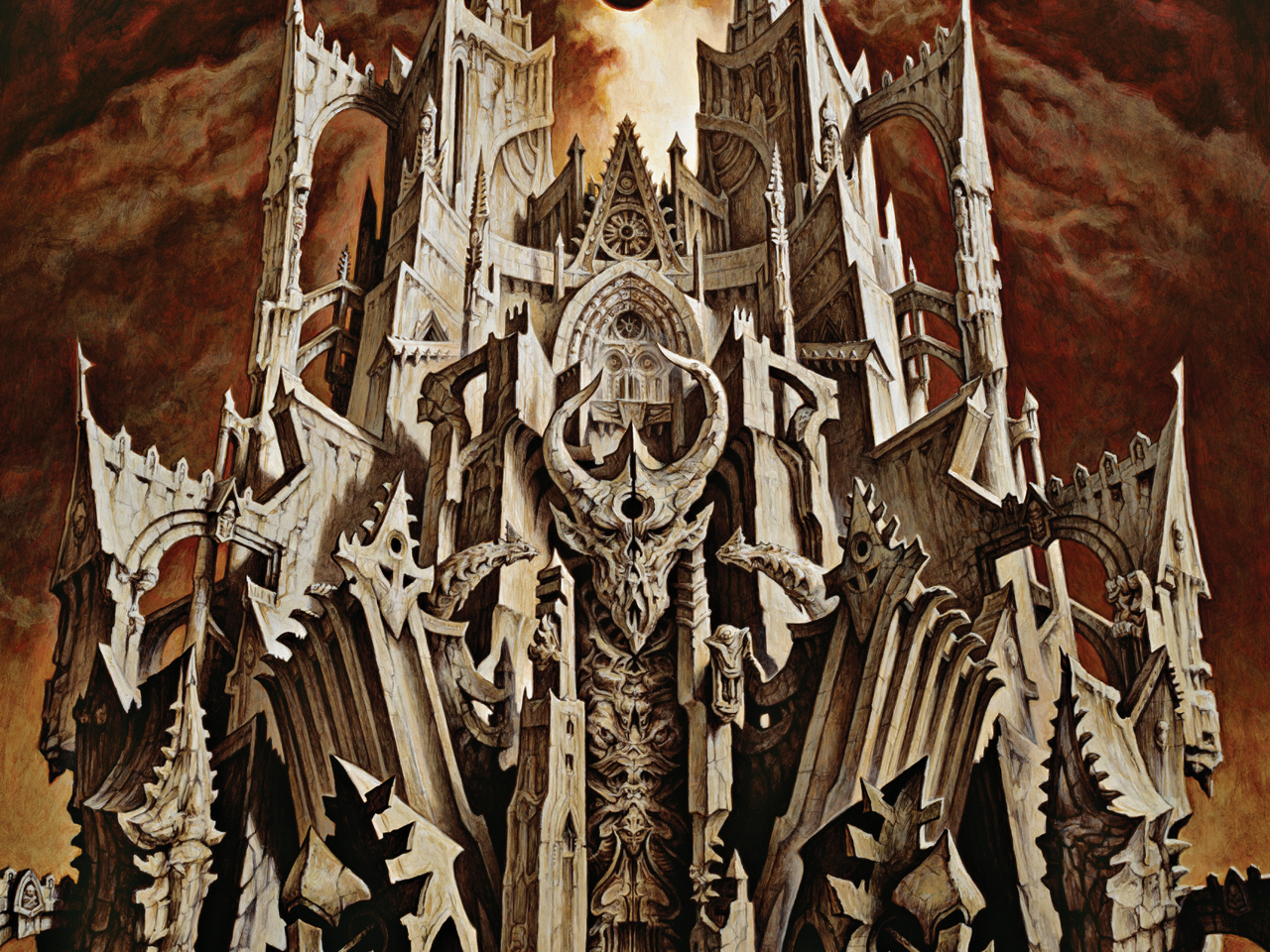
We’ve had the pleasure of working with a great number of artists to help bring the aesthetic of Demon Hunter to life, and it’s been awesome to see it evolve into so many great iterations over the years.
Also I would love to hear a little more about how you came up with that common visual theme idea for Demon Hunter! Or what helped influence that decision and the ultimate manifestation?
Literally from the first second we started working on the debut album, we knew how things would pan out if the band were to continue beyond that one record: The first album—as an introduction—would simply be self-titled. It just made sense.
We also knew that the logo had legs… especially after selling a decent number of logo-centered shirts prior to releasing any material whatsoever… so it felt like a perfect idea to make every album cover be a variation thereof. It’s never even occurred to me to stray from that initial parameter.
The discography we always reference with regards to the Demon Hunter cover model is Chicago. They utilized their logo on every cover, but found new and interesting ways of executing it. It’s been the perfect formula for us. It allows us to rethink the details without having to toil over the big picture.
***
Check out more of Ryan and Don Clark's work at Invisible Creature website.
***
Help Support What No Echo Does via Patreon:
***
Tagged: art spotlight, demon hunter
