Those looking for the enigmatic artist behind Frontierer’s Unloved won’t find much. Other than some cursory mentions of the Scottish designer, Mitchell F Gillies’ hiring to a firm, and the designer’s own, largely bare, website there simply isn’t much to see. What’s there, however, is somehow consistent with what can be seen of his intriguing and off-putting oeuvre-a simple statement that he is a designer working across dimensions.
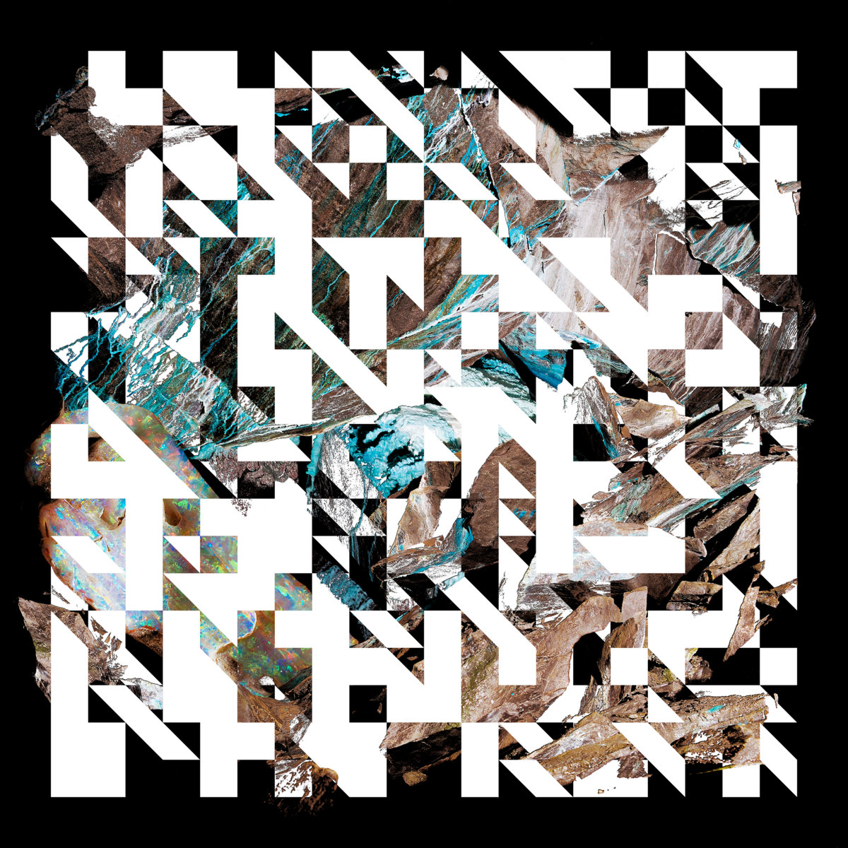
With Frontierer’s new record, Oxidized (out this past Friday), now seems like an excellent time to look back at their breakthrough record and what is such an immediately arresting album cover and such a strangely accurate visual representation of the band’s own brand of deeply disturbing and future-forward chaos.
I would love to know how you approached this Oxidized project in particular. Were you given a blank canvas? What helped influence the final product? How did you make the choices you did?
I had worked with Frontierer on the prior album, Orange Mathematics; that record established certain visual themes that we wanted to expand upon. Limited colour palette, a commitment to a specific visual or motif across both the artwork, the merchandise and any socials the band would use for promotion.
Kieran McMaster and I worked together on Unloved and decided that a visual evolution of the prior record would be appropriate because it was such a discussed aspect of the band, this kind of monolithic identity.
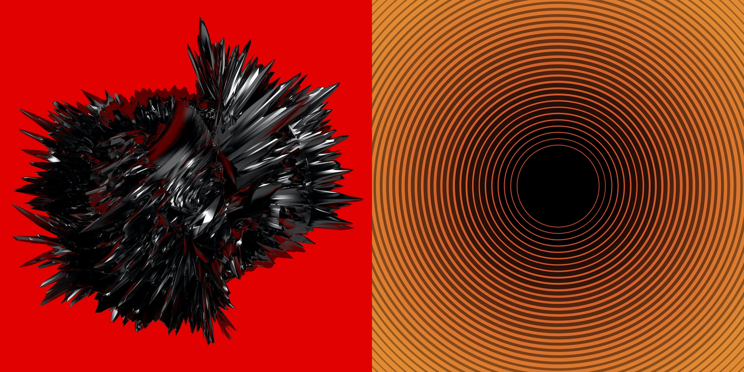
We knew we wanted there to be a central image, in the same way Orange Mathematics has a definite focal point, the black hole. We decided that if the cover of Orange Mathematics was a black hole, then this record would be 'red-shifted' as the music was drawn further in.
In what work of yours I can see, i see a lot of typography and projects that take a clever and innovative approach to simple forms and shapes. Does looking at simple things in an unconventional way come naturally? Or was it honed through formal education?
I have a degree in graphic design, so there's definitely a taught component, but I guess there's a little bit of an initial 'something' that drew me to the field. I've always liked pretty austere, corporate-looking design; the first design I remember really loving was The Designer's Republic's work on the game WipeOut.
In terms of typography, I was lucky enough to get to focus on that at university, and then upon graduating I worked in London for an agency that also did a lot of type design. That's an increasingly big thing for me.
Mitchell Gillies' visualizer for Frontierer's "Opaque Horizon" single:
The way I read both the Frontierer cover and some of your other work was it inhabiting this really terrifying digital space where forms and shapes are distorted and the (stay with me i am doing my best to convey this abstract feeling the record cover gives me) sheer monolithic silence is deafening. Almost like we as viewers are being obliterated by this alien digital force.
Is the digital world horrifying? is that a theme in your work or am I just going off?
The 'heart' is definitely foreboding! Weirdly enough one of the reference points for Kieran and I when we were working on Unloved was that shit sci-fi show Andromeda, which I had watched through in a daze one week having quit my job and come back to Scotland. I had done a bit of reading on the original script for it, and the writer had intended the show's big-bad, The Spirit of the Abyss, to be gravity itself, as an embodiment of love, attempting to crash the universe back together again. The through-line between gravity, love and the visual style we were going for felt very complete, so the idea of this black hole heart came out of that.
The digital aspect of it is largely more circumstantial I think; we were quite conscious of Frontierer being a very digital band, with the 'glitchiness' becoming something of a visual quirk that we actually resisted a little bit for Unloved. We even removed the glitch in the band logo for this album cycle, and the use of the big, ornate serif typeface (BlazeType's APOC) was a deliberately physical choice. Oxidized was approached in an entirely different way which was very exciting.
I don't think my own work necessarily has themes, but if I have a long term project or client, I like to get in at ground level and establish and then evolve them over time. This doesn't really work with most bands I don't think, but it's really great when the opportunity to do it presents itself. I'm actively resisting having a 'style' for myself, I'd prefer to be a bit chameleonic!
Theres a lot of play with texture in your work. Theres a grittiness and tactileness that one doesn't often see in similar design portfolios. What helped influence that approach?
I think compared to some other people who primarily do work for bands I'm incredibly sterile and clean! I toe the line a bit because the bulk of my work is commercial/corporate and I get to do music projects as a side thing. I'd love to do more, though musicians are very precious about their work and the success of me storming in and suggesting a hyper-austere identity really depends on the individual.
Any dream clients or projects you want to put out in the universe?
Whilst we're all currently in COVID-19 mode, design life is somewhat on pause, but it has always been my intention to improve my type design and get that to a point where I can start making commercial releases. I have a few ideas and early prototypes that lockdown is giving me an opportunity to dig into.
Dream client-wise, nobody specific, but clients who want to have cohesive, dynamic and interesting identity systems who are willing to be a bit experimental. I think you can do cool work in any field, whether it's a band, a big sportswear company or something like a small local charity.
I'm also trying to build a studio of sorts with a long-term collaborator. That's a big one!
How did you first discover your aptitude for design? What other visual artists or designers have had an influence on you?
I'm very much that dull, stock story—the kid who was always drawing. But I never wanted to be an artist so I had it in my head that I wanted to do architecture, because I didn't know there was such a thing as graphic design.
Some creatives (broad church) I really love include; Iain M Banks, Jody and Luke Hudson-Powell, Neri Oxman, Actual Source, Warp Records, Metahaven, Arca, Muriel Cooper, Gregory Crewdson, The Designers Republic (of course), and I maintain a soft spot for Damien Hirst. I think all of them question the limits of their discipline and push things in a way that's really valuable, whether that's technically or thematically.
***
Oxidized is out now and available in several formats. See more of Mitchell F Gillies work on Instagram.
Tagged: art spotlight, frontierer